## Key Concepts
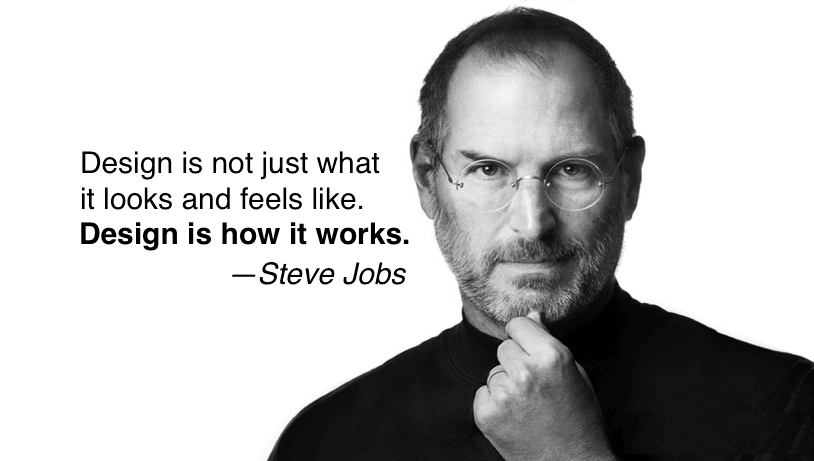
- Design is about how things work not how they look
- Always design with the customer experience and the sense of future in mind
- Making products just functionally adequate is **not good enough**, they should be **great!**
- We can achieve what we want when we are **laser focused**!
### Steve on Design
[](https://www.youtube.com/watch?v=Ddjy_hTO7Tc)
### Laser Focus
```
Steve Jobs advice to Larry Page:
Figure out what Google wants to be when it grows up.
What are the five products you want to focus on?
Get rid of the rest, because they’re dragging you down.
```
## Process vs Content and Innovation
```
Apple is a very disciplined company, and we have great processes.
But that's not what it's about.
Process makes you more efficient.
- Steve Jobs
```
### Steve Jobs Content vs Process (Video)
[](https://www.youtube.com/watch?v=l4dCJJFuMsE)
- Process gets you efficiency
- Process is not the content and innovation
- Without the **best content and innovation**, the process can't get you much!
- Hire people with content and innovative mind to make your efforts successful!
## Simplicity
- *Simplicity is the ultimate sophistication* - [Leonardo da Vinci](https://en.wikipedia.org/wiki/Leonardo_da_Vinci)
- Simplify things by zeroing in on their **essence** and eliminating unnecessary components.
- **Sony Walkman vs iPod**
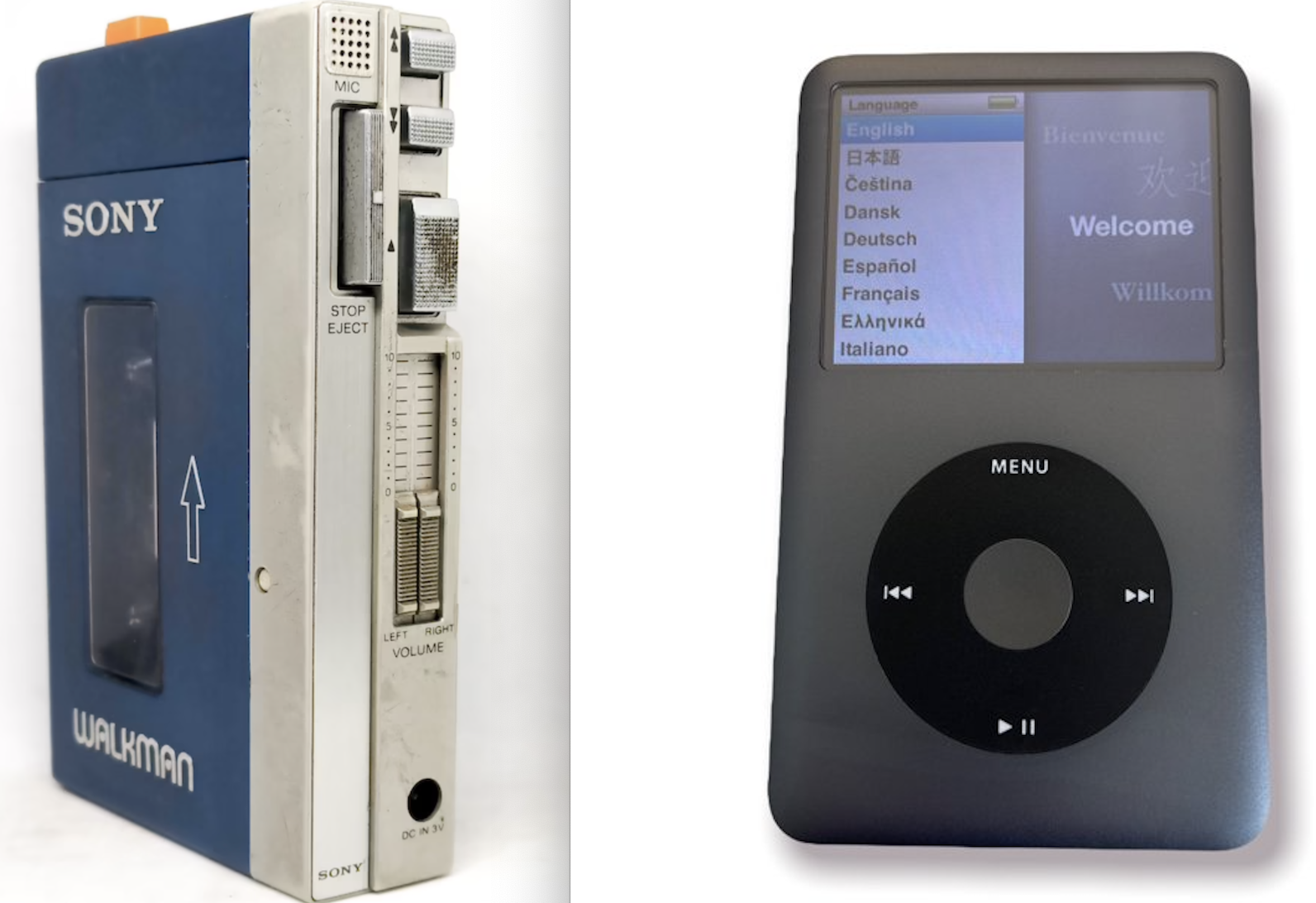
- It usually takes a lot of **hard work** to make something **simple** to:
- truly understand the underlying challenges
- come up with elegant solutions
```
- IPod Design:
At one point Jobs made the simplest of all suggestions:
Let’s get rid of the on/off button. At first the team members were taken aback,
but then they realized the button was unnecessary.
The device would gradually power down if it wasn’t being used and
would spring to life when reengaged.
- Tony Fadell, iPod team lead
```
- Design with simplicity and **discoverability** in the integration as well
```
People are busy.
They have other things to do than
think about how to integrate their computers and devices.
- Steve Jobs
```
- Everyone will agree that:
- Television needs this kind of simplicity:
- Have you able to watch the content you like to watch with few clicks on a simple device?
## Do not build products with does not match:
- Culture/Image of the company
- Distribution channel of the company
- Current and future customers
- Integrate customer experience into the design and development to build:
- **Beautiful, elegant and simple-to-use products** providing superior functionalities
- **Make product to evolve**
- This provides motivation for *continued innovation*
- Like Salesforce delivering 3 times in a year:
- With hundreds of **innovative features** to the customers with 3 times a year during seasonal releases: **Spring, Summer, and Winter**
### Video about "Make product to evolve"
[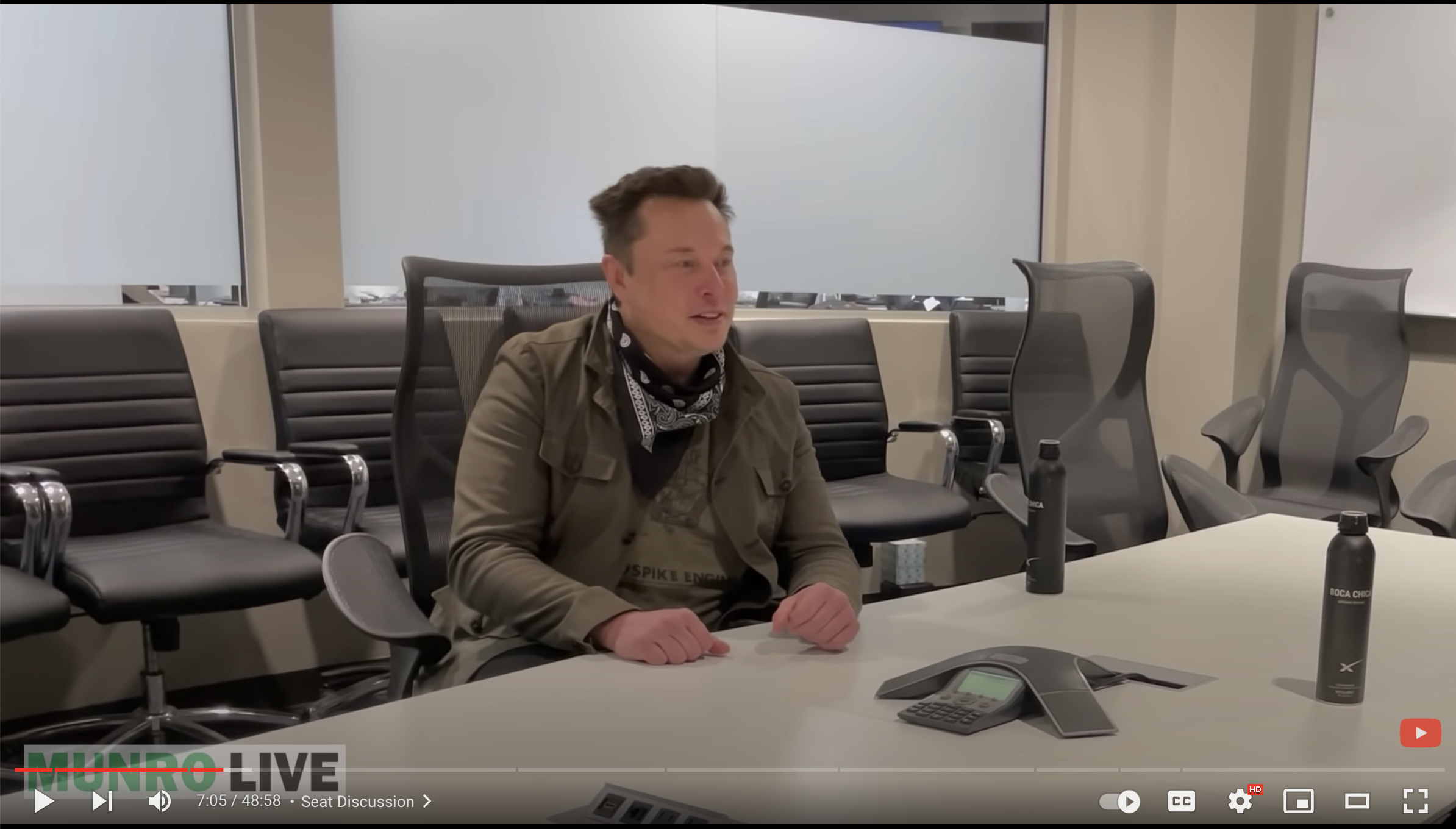](https://www.youtube.com/watch?v=YAtLTLiqNwg)
- 1. A door where the design tells you to do the
opposite of what you're actually supposed to do.
- 2. A door that gives the wrong signal and needs
a sign to correct.
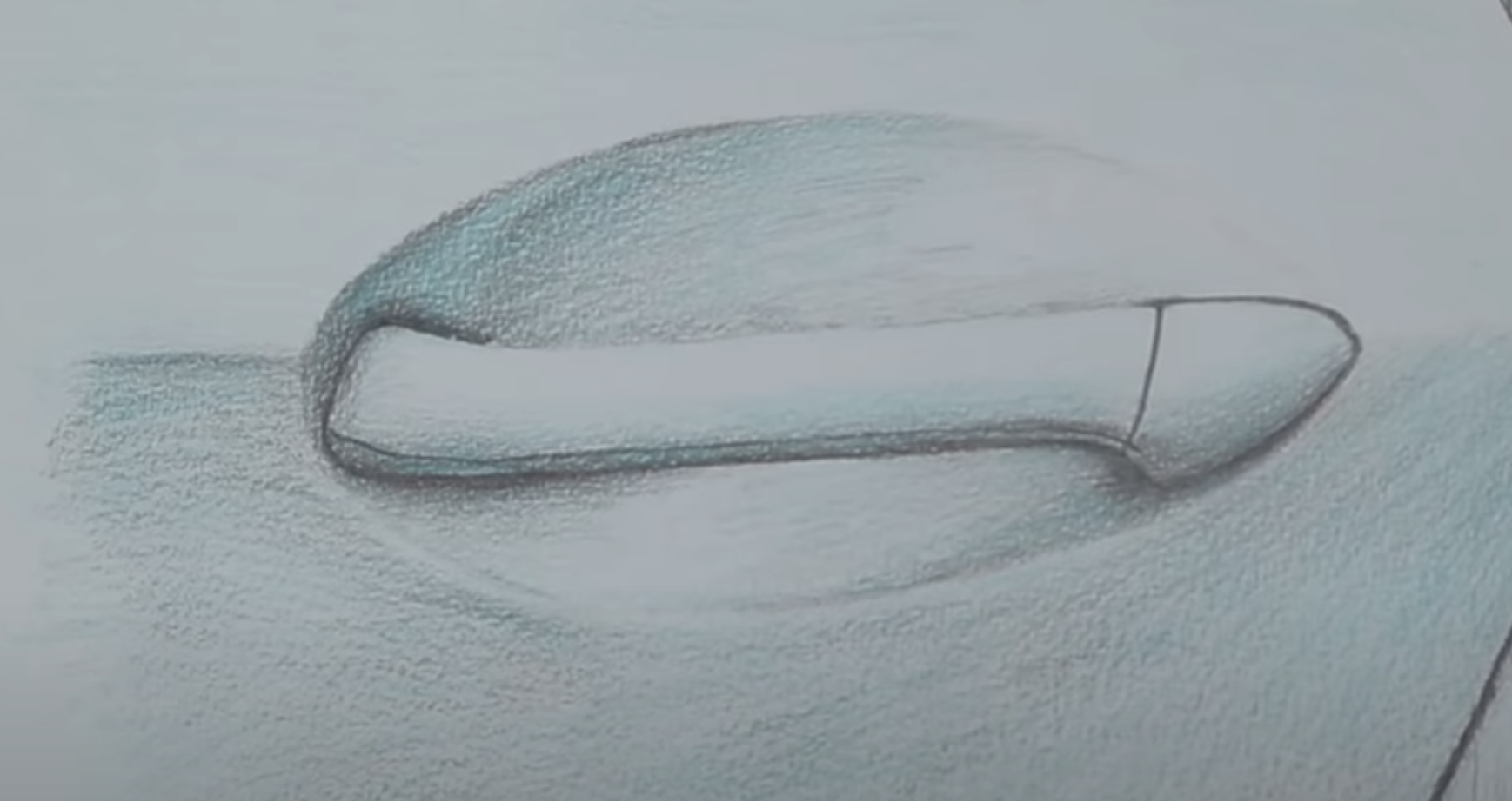
### Discoverability and feedback
- The ability to discover what operations one can do
- Product gives feedback - signal of what happened
[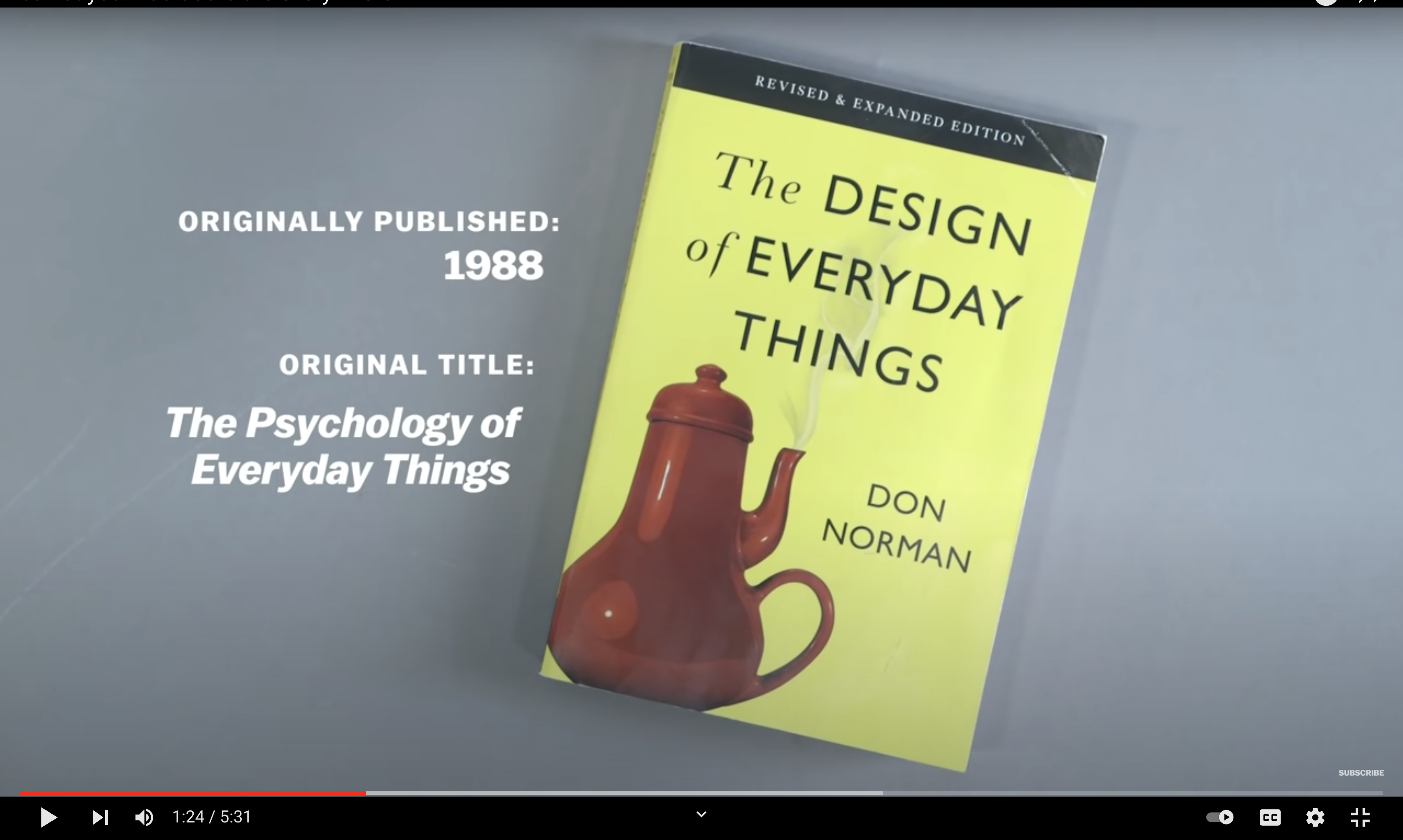](https://www.youtube.com/watch?v=yY96hTb8WgI)]
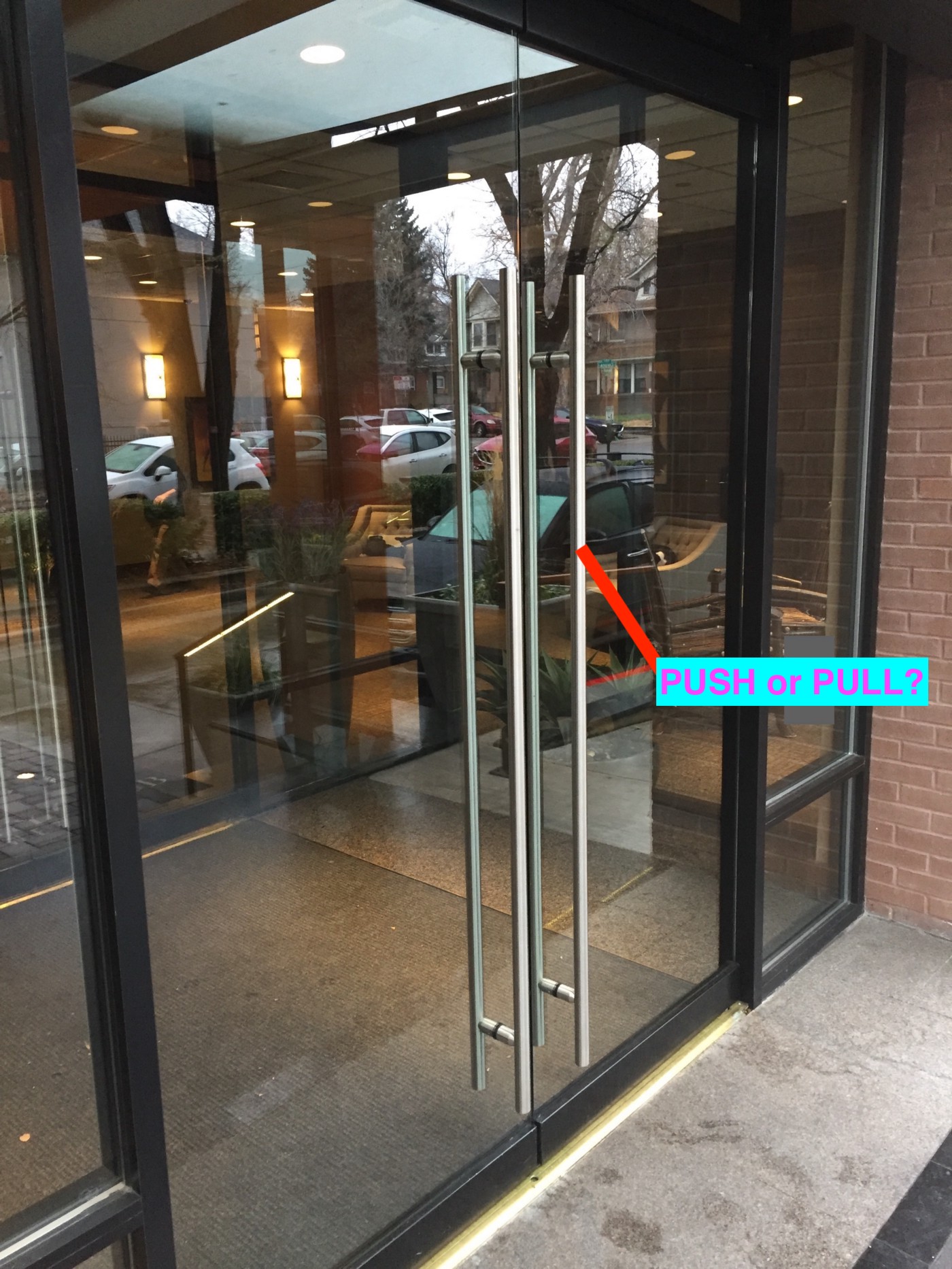
### Right Design
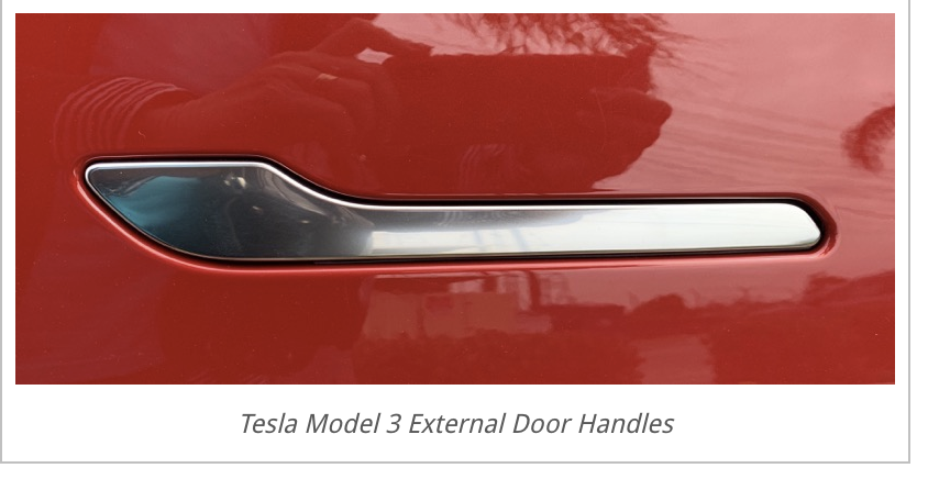
- Push Door : Door with flat plate: only thing you can do is push!

- Pull or push Door : Door with
### Indian Temple Discoverablity


[](https://www.youtube.com/watch?v=4up9baE7pmQ)]
- **It is an Idea generation methodology**
## An **iterative process** in which
- We seek to **understand** the user
- **Challenge** assumptions
- **Redefine** problems in an attempt to **identify alternative strategies and solutions**
that might not be instantly apparent with our **initial level of understanding**.
- Revolves around a **deep interest in developing an understanding of the people**
for whom we’re designing the products or services.
- Helps us in the process of **questioning**:
- problem
- assumptions
- implications
- Involves **ongoing experimentation**:
- sketching
- prototyping
- testing
- trying out concepts and ideas.
## Stanford D School
### Goals
- Coming with ideas and verifying that they are good!
- Make **tools, mindsets, ways-of-thinkings and frameworks** that helped designers to solve problems **available to** to all
[](https://www.youtube.com/watch?v=vSuK2C89yjA)
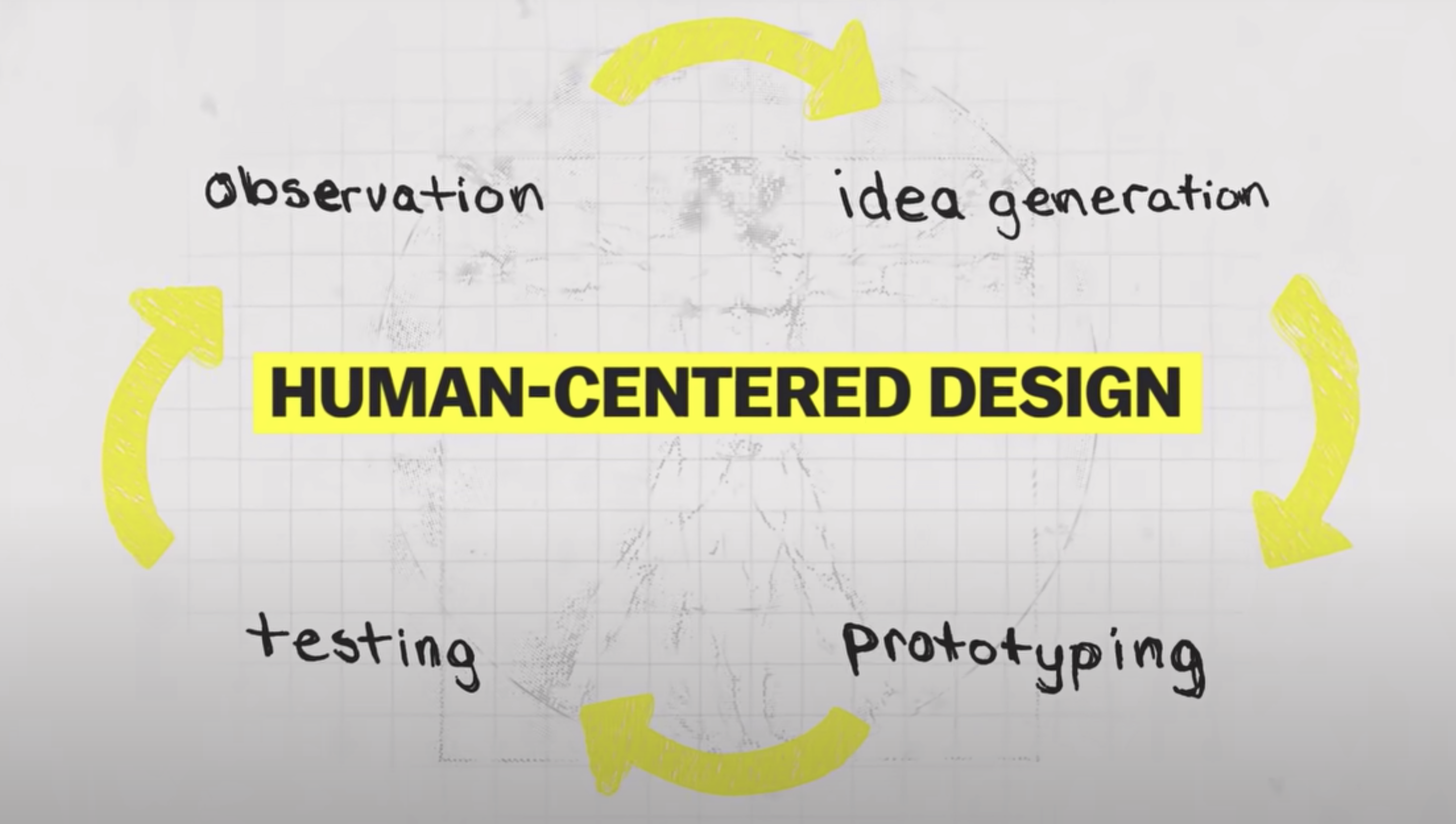
- 1. Focus on the people.
- 2. Solve the underlying problem, not the symptoms.
- 3. Everything is part of a system: Design for the system.
- 4. Prototype ideas, test, and refine them, over and over again.

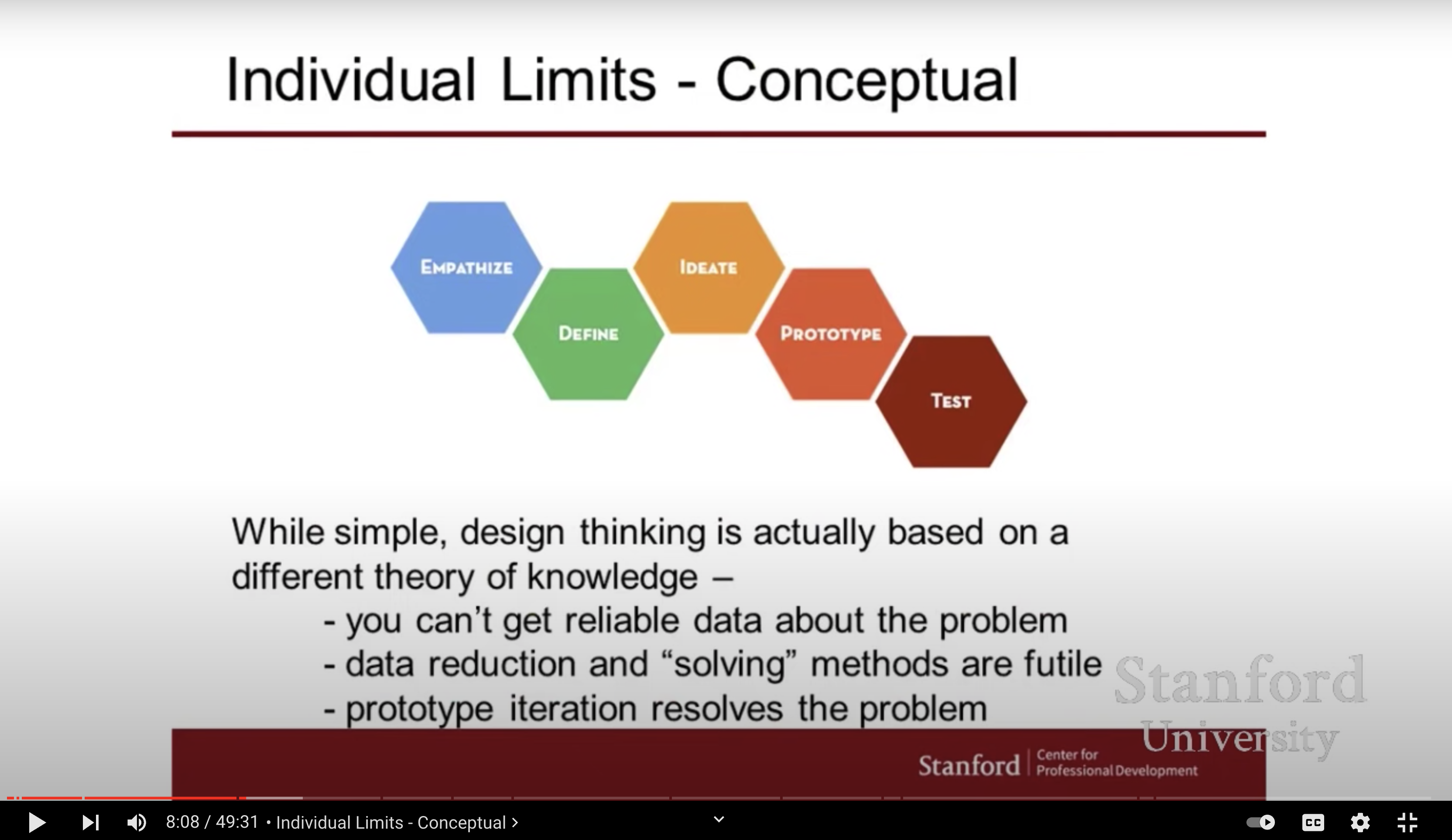
- **Empathize** – with your users
- Foundation of human centered
- Uncover needs that customer have which they may or may not be aware of
- Guide innovation efforts
- Identify right user to design for
- Discover the emotions that guide behaviors
- **Define** – your users’ needs, their problem, and your insights
- Scope a specific and meaningful challenge
- Explicitly explains the problem we are solve
- **Ideate** – by challenging assumptions and creating ideas for innovative solutions
- Generate radical design alternatives
- Going wide in terms of concepts and outcomes
- Step beyond obvious solutions
- Harness collective perspectives
- Get obvious solutions out of your heads
- **Prototype** – to start creating solutions
- Getting ideas and explorations out of your head into the physical world
- Learn
- Solve disagreements
- Fail quickly and cheaply
- **Test** – solutions
- Getting feedback on the solutions
- Refine solutions to make them better
- Continue to know about the customers
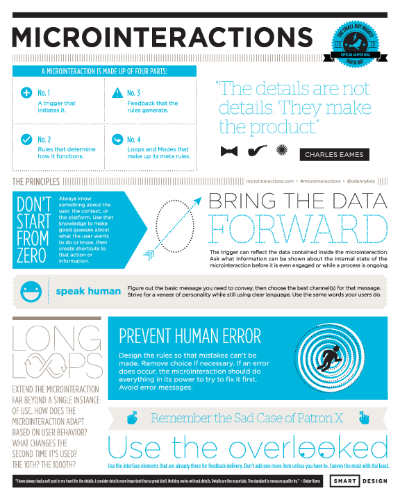
- Micro interactions are commonly defined as the smallest unit
of user interaction **boiled down to a single use case**
- Task-based and goal-oriented **engagement details** that
users have with interfaces that can:
- inform
- enhance
- supply context
- prevent errors
- provide delightful experiences
### Examples
- [Refer Toolkit](https://info-design-lab.github.io/microinteractions/Slides/Toolkit.pdf)
- **Alerts and Notifications**
- Notifying about the ongoing progress of an event
- Notify any new items needs user attentions via alerts
- **Keeping Context**
- Maintain continuity in between sequence of interactions
- **Smart Defaults**
- Weather app providing the weather details for the user based on the user's geolocation
- **Interacting with Data Elements**
- If the user is entering a numbers only, provide a number keyboard
- If the user entering a email, provide keyboard suitable for email data entry
- **Writing, linking, sharing content**
- Highlight content that needs focus
- Chat app showing other party is **typing...**
- **Preventing Human Error**
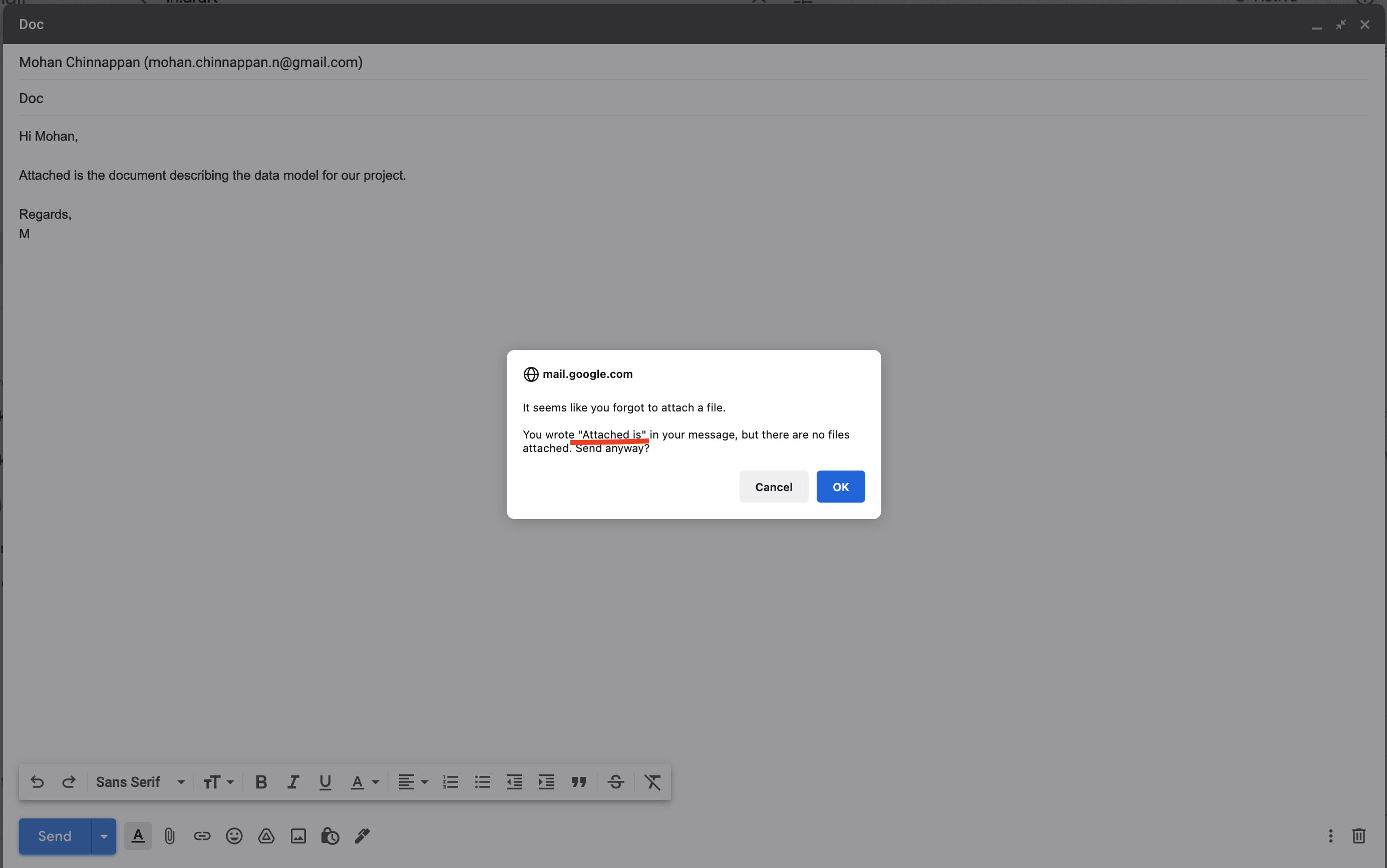
### Key Principles
- Bring Data forward
- progressive disclosure
- do not throw every piece of data at the user
- allow them to discover it over time
- Example a badge on the icon to show how many message you have now!
- showing what is important data
- what info is available
- in what increments
- when we can present them?
- all these info is important at different times
- align the information delivery with when the user needs them
- within what context making it appropriate?
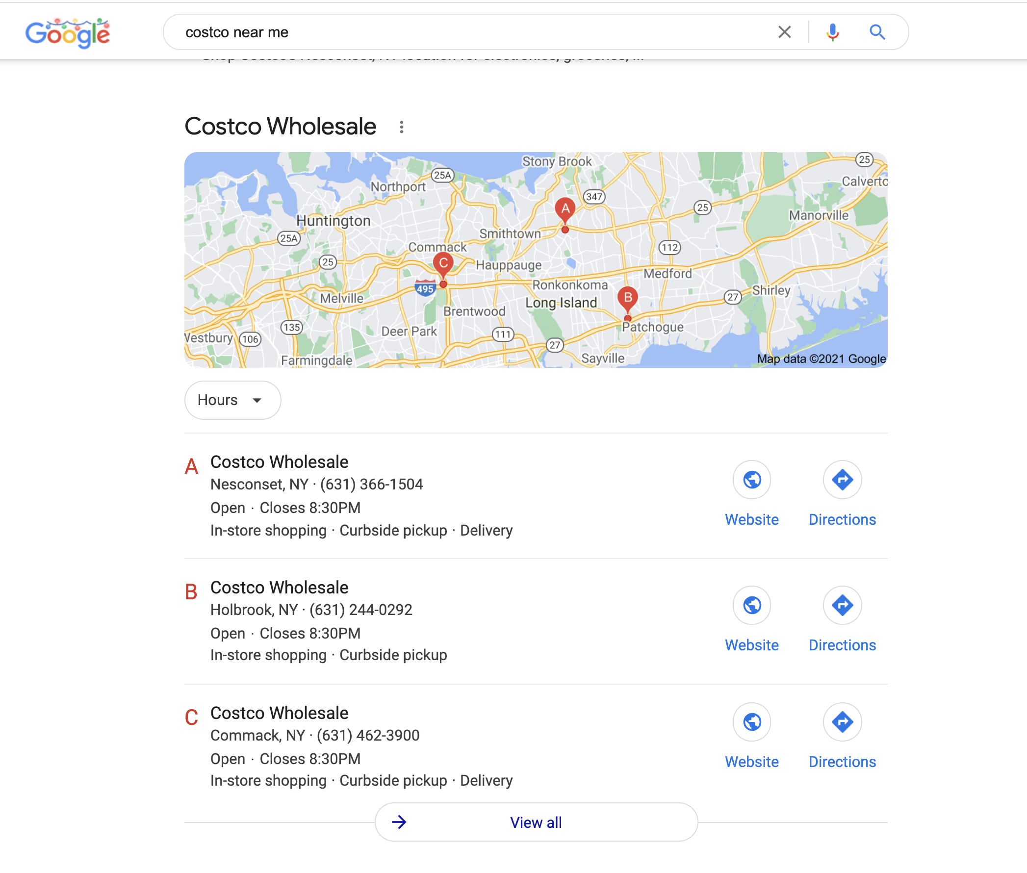
- Google provides a value added information
- address
- open or closed
- phone number to call
- Don't start from 0
- Devices in channels captures information about the caller for example, make use of that info as starting point
- Example location specific info - weather using geo-location
- What is the system knows
- Device type / Browser type
- Time of the day
- Location
- User Role
- Age/Sex
- Example knowing the browser and provide info for that browser
- MacOS reducing the fan speed when the user is using dictation
- User Behavior
## Background
[](https://console.cloud.google.com/)
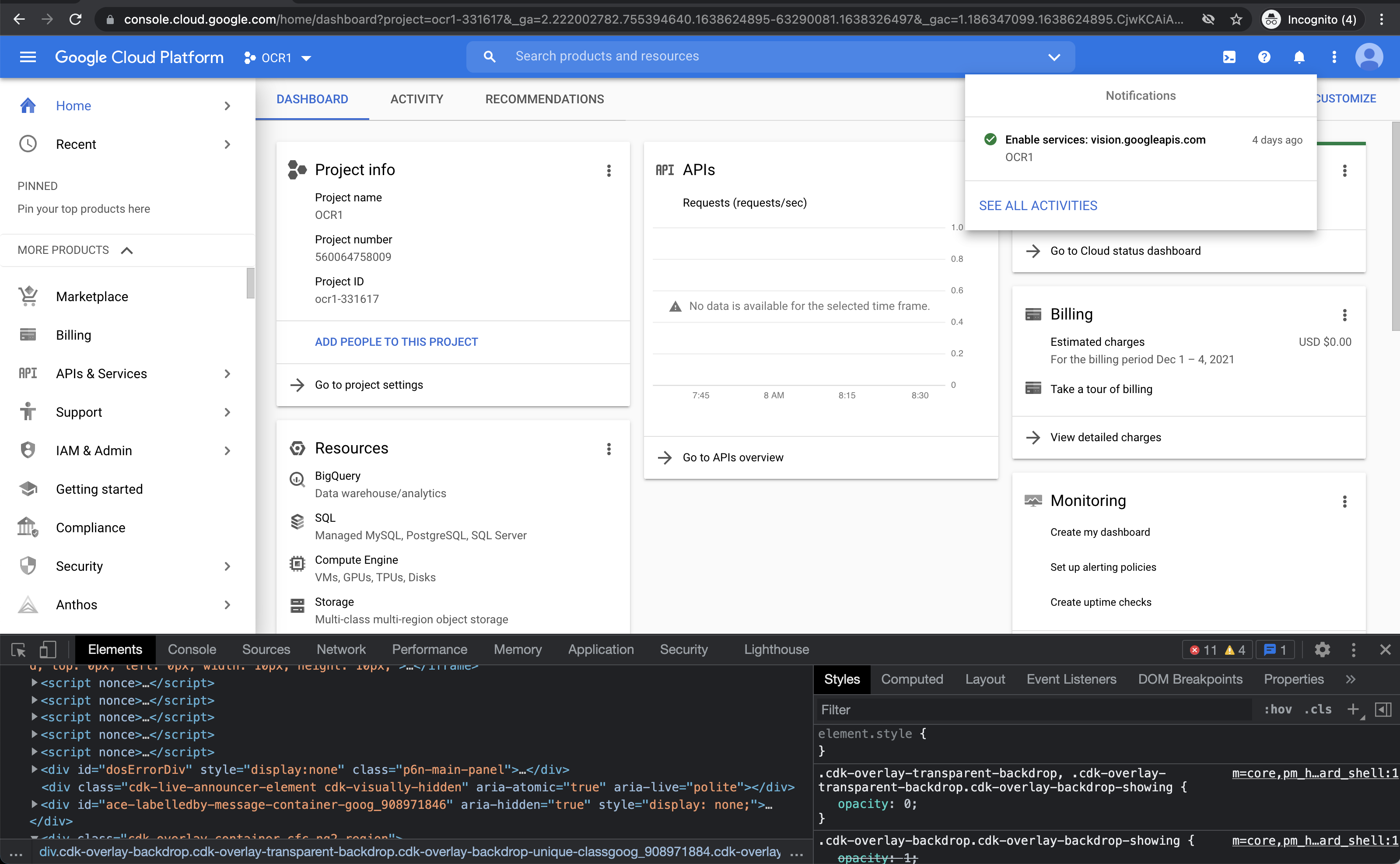
- Google Cloud Platform (GCP) is an application that I love and use almost every day
- Every time in the GCP UI, I feel it can be better and Human Centered Design (HCD) can used to improve this great application.
- Looks it is a one giant Angular application written by various sub-teams
- Lacks the **progressive disclosure principle**
- Kitchen-sink or [**showing org-chart**](https://donorem.medium.com/shipping-the-org-chart-3319181be9bd) UI
- Sub-systems are not **integrated** in a seamless way!
- Makes to remember Steve's idea of **removing on-off button** in iPods
- Usual outcome if the sub-teams are *not properly coordinated*
- To fix this GCP team has to write large volume of help documentation
- [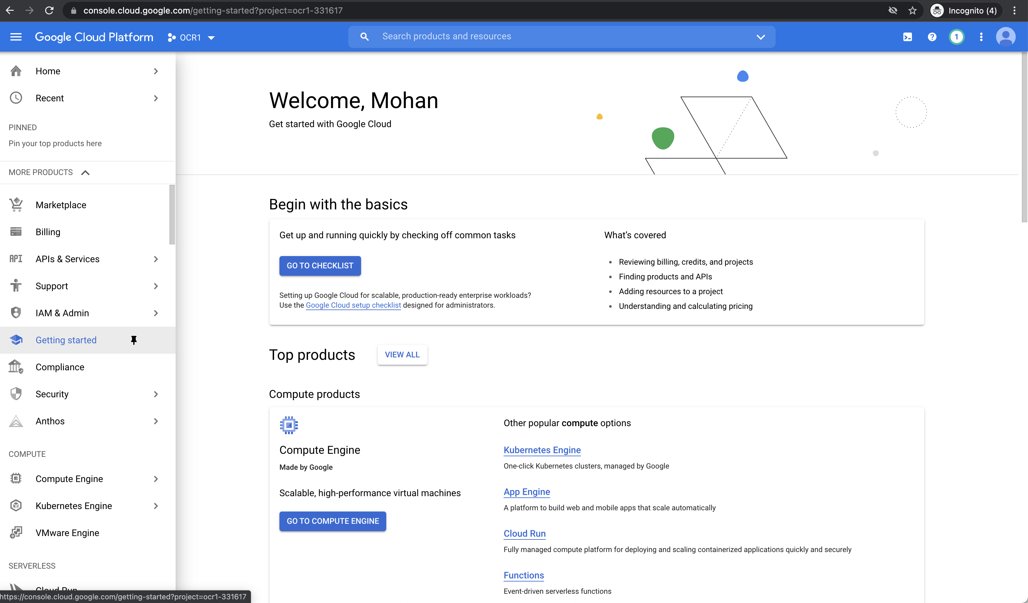](https://console.cloud.google.com/)
- This is hard to maintain and sustain
- [GCP : Documentation](https://cloud.google.com/docs/)
- Sometimes, I feel GCP does not follow the follow this rule:
- **Do not start from zero**
- This will end up in poor customer satisfaction (CSAT)
### How to fix this?
- GCP can have feedback feature, where users like me can provide suggestions like AWS has for the beta versions of the AWS console
- Follow Human Centered Design (HCD) like **MIT and Altitude done for Elderly Walker** as in this video:
[](https://www.youtube.com/watch?v=kq2kd3CXi1o)
### How is AWS console doing in this area?
- I love this application too!
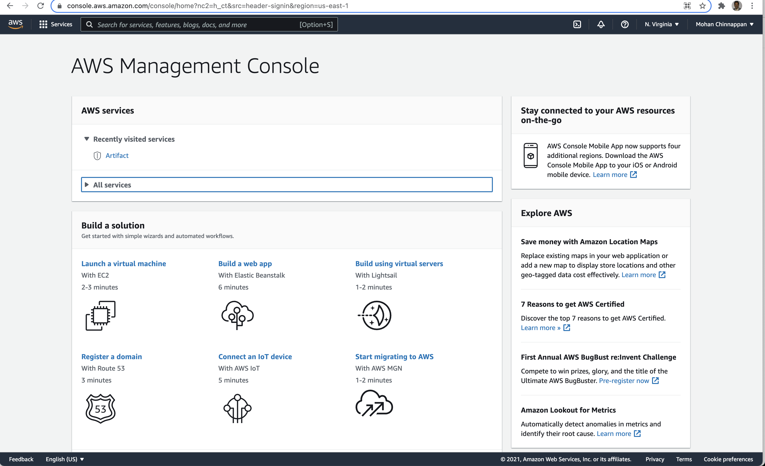
- AWS console uses progressive disclosure in the main page
[](https://aws.amazon.com/console/)
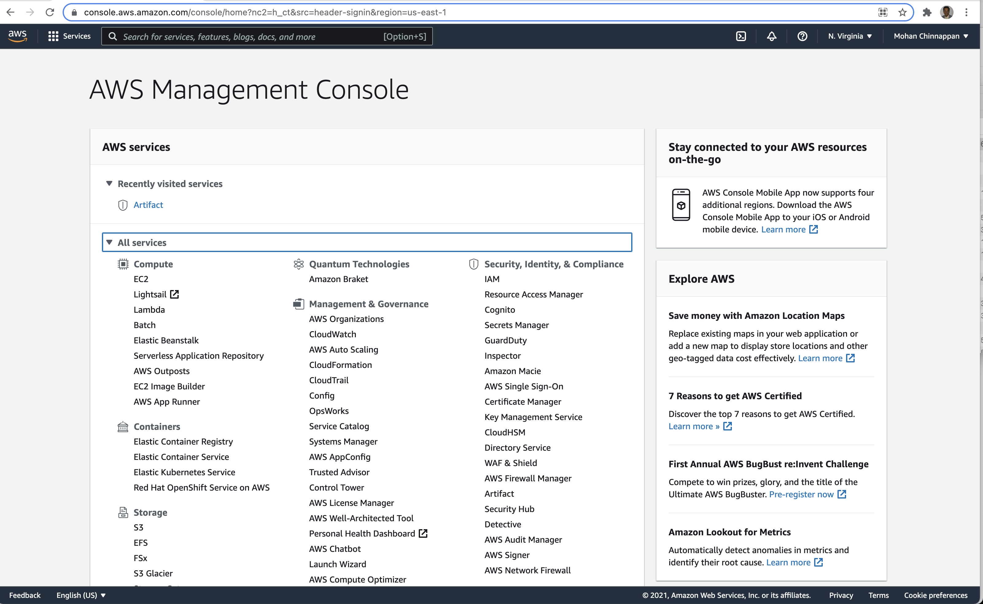
- But it falls back to kitchen-sink or **showing org-chart**
[](https://aws.amazon.com/console/)
### How is Apple Store connect doing in this area?
- Another great application
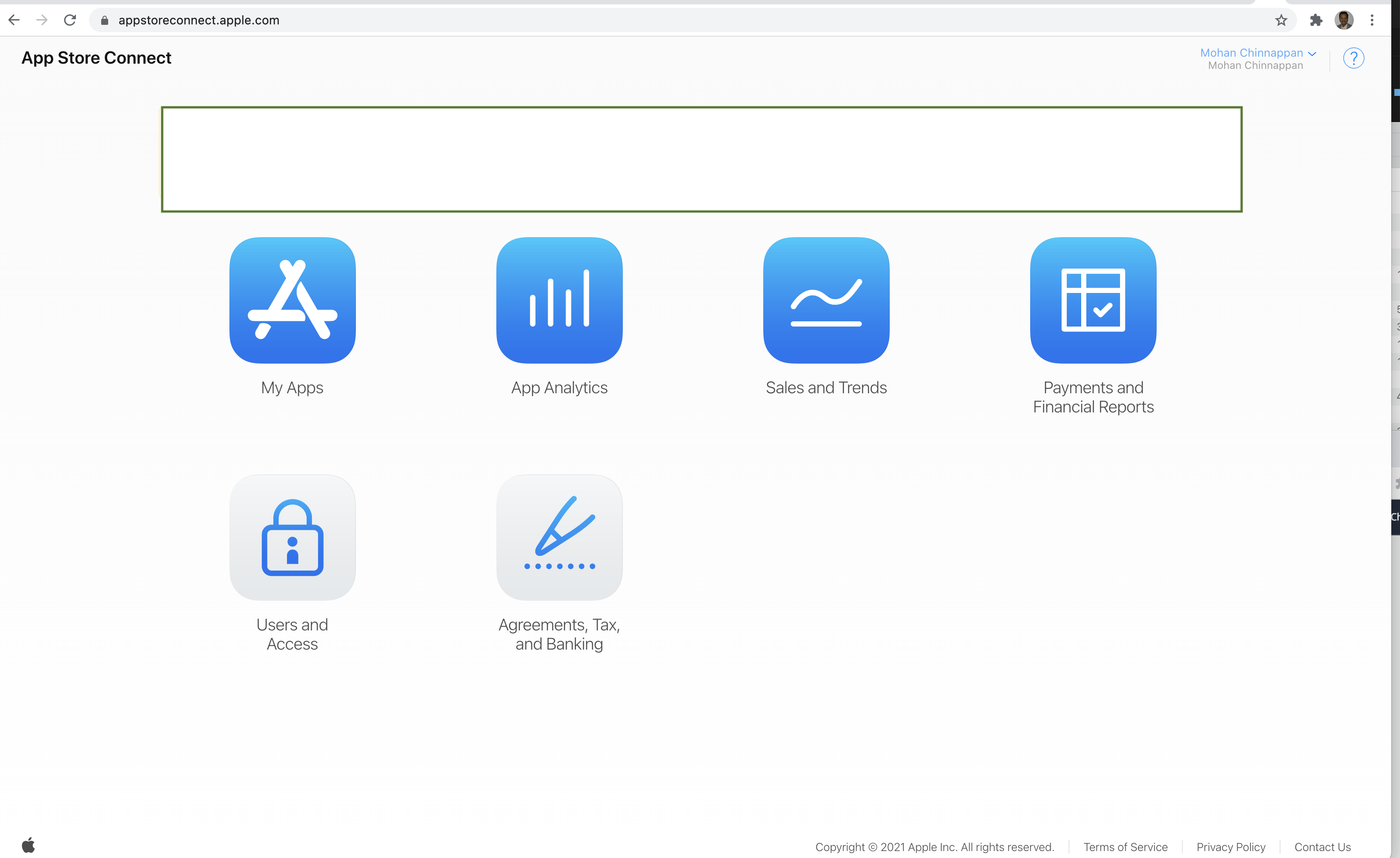
- It is not perfect yet, but made lot of progress in Human Centered Design Area (HCD)
[](https://appstoreconnect.apple.com/)
### What is "Do not start from zero"?
- The product should try to know the user as much as possible
- With that information provide correct choices and navigation to the user
```
Example of a poor Experience with a home internet provider who is suffering from
- "Do not start from zero"
Use case:
- You have to change the cable modem and you need to call tech support of the cable company
Your action:
- Call the tech support of the cable company (say XYZ)
- You land on Interactive Voice Response (IVR)
- You press 2 to service department
- you provide all the information to this service rep
- service rep says, you need to call another number for model replacement
- rep transfers to you another number, that number goes to voice mail
- you try again and get another service rep
- you provide your details to this service rep again!
- this time rep transfers to you another number, you got transferred correctly
- this new rep asks the same details you have provided already two times!
- you feel like: how can I change the cable company!!!
```
### Typical IVR menu
- Thank you for calling XYZ Corporation. If you know your party’s extension, you may
enter it at any time. Please choose from the following options:
- For our sales department, press 1
- For our service department, press 2
- For our billing department, press 3
- For all other matters, press 0
## Lab Resources
- [Design Thinking](https://mohan-chinnappan-n2.github.io/2021/wp/design/dt/dt.html)
## Articles, Videos and sites
- [Harvard Busines Review: The Real Leadership Lessons of Steve Jobs](https://hbr.org/2012/04/the-real-leadership-lessons-of-steve-jobs)
- [IDEO - human-centered design](https://www.ideo.org/tools)
- [Google Design](https://design.google/library/simulating-intelligence/)
- [Google Design best of 2020](https://design.google/library/google-design-2020/)
- [Human Interface Guidelines](https://developer.apple.com/design/)
- [inVision: Human-centered design](https://www.invisionapp.com/defined/human-centered-design)
- [The Details about Details](https://www.youtube.com/watch?v=I9ia9dabG8I)
## Microinteractions
[Dan Saffer: Microinteractions](https://www.oreilly.com/library/view/microinteractions/9781449342760/)
[Toolkit](https://info-design-lab.github.io/microinteractions/Slides/Toolkit.pdf)
[Little Big Details](https://littlebigdetails.com/)
## Don Norman
- [I wrote the book on user-friendly design. What I see today horrifies me](https://www.fastcompany.com/90338379/i-wrote-the-book-on-user-friendly-design-what-i-see-today-horrifies-me)
- [Waste is an enormous problem. But recycling is the wrong solution](https://www.fastcompany.com/90463116/waste-is-an-enormous-problem-but-recycling-is-the-wrong-solution)
## UX
- [Intro to UX: the Norman door](https://uxdesign.cc/intro-to-ux-the-norman-door-61f8120b6086)
- [Elements of UX: A Librarian's Guide to User Experience Design](https://guides.mblc.state.ma.us/elements-of-ux/why-ux)
- [Ask More Questions](https://www.interaction-design.org/literature/article/question-everything)
## Videos about "Make product to evolve"
[](https://www.youtube.com/watch?v=YAtLTLiqNwg)
## Shipping Org Charts
- [**showing org-chart**](https://donorem.medium.com/shipping-the-org-chart-3319181be9bd)
- [Org Charts](https://bonkersworld.net/organizational-charts)